Social Determinants of Health in Urban Neighborhoods
Decades of housing disinvestment from a 1930s lending policy still shorten lives today.
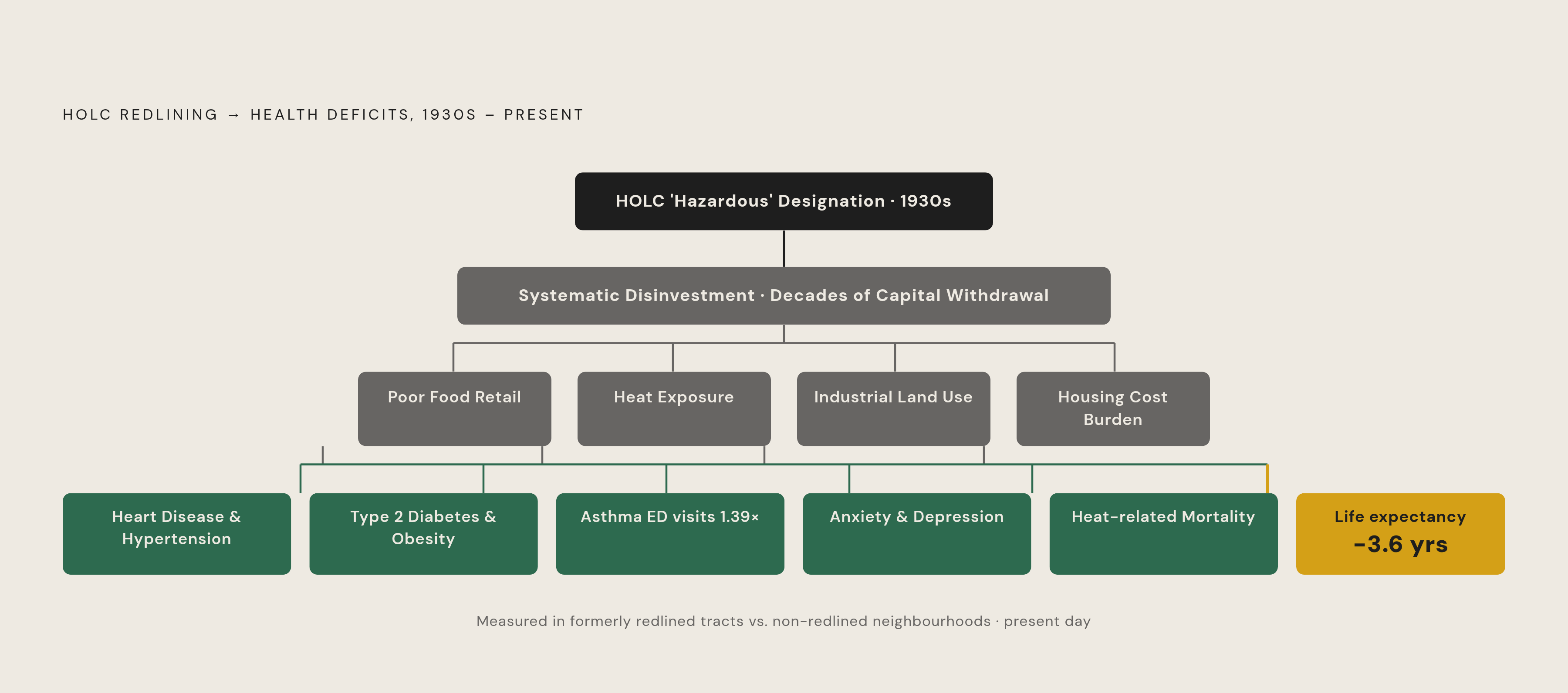
The federal Home Owners' Loan Corporation, operating in the 1930s, graded neighborhoods across American cities by perceived mortgage risk. Neighborhoods with majority-Black populations, along with those hosting significant immigrant communities, were marked "hazardous" and shaded red on agency maps. Mortgage capital was steered away from them, deliberately and systematically.
What followed was not merely economic. Disinvestment in housing stock, infrastructure, and retail tracked those maps across decades, and the shaping has proven durable in ways researchers can now measure with uncomfortable precision. People in formerly redlined communities have a life expectancy roughly 3.6 years lower than those in other communities. Rates of heart disease, type 2 diabetes, hypertension, and obesity are significantly elevated in these areas, according to data presented at the American Heart Association Scientific Sessions in 2024. Asthma emergency department visits in redlined census tracts run 1.39 times higher than in the lowest-risk tracts. Residents of formerly redlined neighborhoods report significantly higher rates of anxiety and depression.
So: how does a policy instrument from the 1930s still register in emergency departments and disease registries nearly a century later? That is the question this whole field is quietly organized around, and I am not sure it has a satisfying answer yet, only an increasingly detailed description of the mechanism.
A 2025 study published in Frontiers in Public Health examined Boston neighborhoods shaped by 1930s discriminatory lending, specifically Dorchester, Roxbury, and Mattapan. Those neighborhoods showed higher prevalence of hypertension and obesity and more limited access to healthier foods than wealthier parts of the city. The comparison is instructive because the geography is tight: these are neighborhoods separated by a bus ride, not a county line.
Redlining's legacy determined more than wealth accumulation. It determined where grocery stores would be built, which land would be paved versus planted, and which blocks would be sited adjacent to industrial uses. Everything that follows in this piece is, in some part, downstream of those decisions.
What the Food Environment Looks Like When You Live in a Disinvested Neighborhood
Food insecurity follows income with a consistency that resists alternative explanations. Among households below 185% of the federal poverty level, 27% are food insecure; among those above it, the figure is 5%. A fivefold difference. But income alone does not close the account.
The Urban Institute's 2024 Well-Being and Basic Needs Survey found that food hardship remained significantly above pre-pandemic levels, concentrated most heavily among Black and Hispanic/Latinx adults, households with children, adults with disabilities, and LGBT adults. Roughly a third of Black adults and about a quarter of Hispanic/Latinx adults reported receiving charitable food. At that scale, reliance on food banks is not emergency response. It is a structural feature of how these communities sustain caloric need, month after month.
The proximity framing, the idea that the core problem is distance to a grocery store, misses something important. Research in Philadelphia found that stores in neighborhoods with higher proportions of Black residents offer less food choice diversity and fewer healthy options than stores in white neighborhoods. The problem is not only how far you walk; it is what you find when you arrive. Chronic exposure to lower-quality food environments drives the elevated rates of hypertension, obesity, and diabetes documented in formerly redlined communities. The metabolic burden is an expected consequence of a food environment shaped by decades of disinvestment, not a byproduct of individual preference.
At global scale, the UN's High-Level Panel of Experts has identified urban food insecurity as both widespread and deeply unequal, affecting more than 1.7 billion people in urban and peri-urban areas. The American experience is a local expression of a structural pattern that urbanization intensifies wherever concentrated disadvantage and concentrated advantage share a city.
How Housing Cost and Instability Extend Beyond Shelter Into Health
The majority of low-income renting families spend more than half of their income on housing. What remains for food, medication, transportation, and medical care is not a policy abstraction. It is arithmetic, and the arithmetic has health consequences.
Homelessness represents the extreme end of this spectrum. Overall homelessness rose 12.1% between 2022 and 2023, reversing earlier progress. Black Americans, roughly 14% of the U.S. population, represent approximately one in three people experiencing homelessness in 2024.
Eviction's consequences extend further than shelter loss. Housing instability is associated with postponed medical care, delayed medication refills, and increased emergency department visits for children. A study of 9-year-olds found that children who had experienced eviction in the prior year performed worse on memory, mathematics, and vocabulary by the equivalent of up to a full year of schooling. That is not a narrow welfare outcome. It is a developmental finding with long-horizon implications for economic mobility, health behaviors, and chronic disease risk across an entire life course. Losing stable housing does not simply remove a roof; it removes the conditions under which consistent nutrition, medical follow-up, and cognitive development are possible.
Families who cannot afford stable housing are also those least able to afford the food and healthcare that instability puts further out of reach. The determinants reinforce each other's effects, which is precisely why any single-domain intervention tends to feel insufficient when you watch it play out on the ground.
The Physical Neighborhood as a Health Environment: Heat, Air, and Green Space
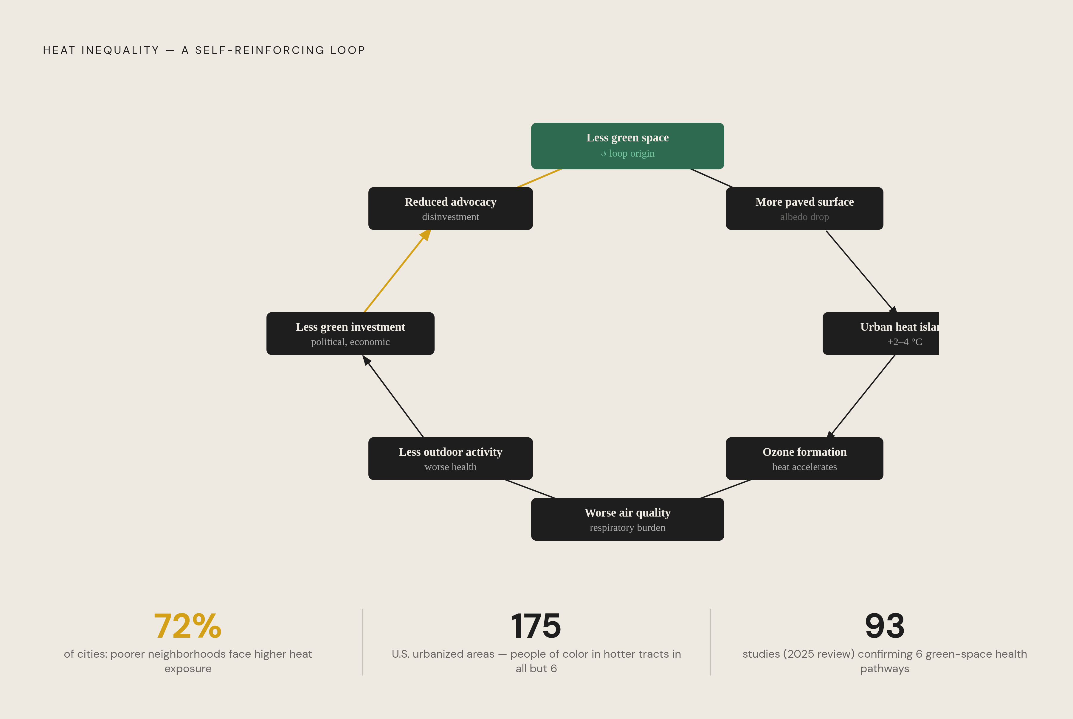
The urban heat island effect is familiar in general outline: paved surfaces absorb and retain heat, raising ambient temperatures in dense areas relative to surrounding regions. What receives less attention is how unevenly that heat is distributed within cities. In 72% of cases examined across a multi-city study, poorer neighborhoods experienced elevated heat exposure as a direct function of intra-city income distribution. The disparity by race is even more consistent: across the 175 largest U.S. urbanized areas, the average person of color lives in a census tract with higher surface urban heat island intensity than non-Hispanic whites in all but six of those areas. Black residents carry the highest average heat island exposure across all climatic zones.
Heat is not merely uncomfortable. Elevated temperatures drive higher mortality rates, cardiovascular and respiratory hospitalizations, and the aggravation of pre-existing chronic conditions, compounding disease burdens already concentrated in the same communities bearing the greatest thermal exposure.
The relationship between heat and air quality is mechanistic. Higher temperatures accelerate ground-level ozone formation by intensifying interactions between nitrogen oxides and volatile organic compounds. Urban heat islands also trap pollutants near the surface, amplifying respiratory disease and asthma burden during heat events. A neighborhood contending with elevated heat and elevated pollution is not facing two separate problems; it is facing a system in which each amplifies the other.
Green space offers a measurable counter to these exposures. A 2024 study found that city residents with greater exposure to urban green spaces require fewer mental health services. A 2025 review synthesizing 93 empirical studies identified six validated pathways through which green space affects health: attention restoration, stress recovery, behavioral activation, physiological regulation, social cohesion, and environmental buffering. These are documented and replicable findings.
The same low-income and majority-minority neighborhoods facing the highest heat and pollution exposure are least likely to have parks, tree canopy, and pedestrian infrastructure. A 2025 study of thousands of adolescents and young adults confirmed significant physical activity differences across income and ethnic groups tied directly to neighborhood infrastructure. Less green space produces more heat, which worsens air quality, which reduces opportunities and incentives for outdoor activity. Inequalities in housing quality, ventilation, and access to air conditioning leave residents of poorer neighborhoods with fewer means to buffer these exposures even indoors.
Why These Conditions Cluster Rather Than Operate Independently
The clustering of disadvantage is neither coincidence nor the sum of independent misfortunes. The same neighborhoods that experienced redlining are statistically more likely to have poor food environments, higher housing cost burdens, industrial land uses, greater heat exposure, and less green space. Each condition was shaped by the same underlying policy logic, and each reinforces the others in ways that make the aggregate burden significantly greater than any single determinant would predict.
The health consequence is multimorbidity: not one disease, but the simultaneous accumulation of chronic conditions shaped by intersecting disadvantages. A person managing hypertension, obesity, and asthma in a formerly redlined neighborhood is not experiencing a set of unrelated diagnoses. Each condition has roots in the same soil, compounded by the same history.
Social and community cohesion constitute an underexamined layer. Neighborhood disinvestment erodes the social infrastructure, community organizations, trust networks, and shared public space, that buffers individual hardship. The green space research explicitly identifies social cohesion as one of six pathways through which environment affects health, positioning the social fabric as a determinant in its own right rather than a byproduct of economic conditions.
Consider the argument that excellent clinical care could compensate for this clustering. Look carefully at what that argument requires. Even excellent primary care cannot address the housing cost burden that delays medication refills, the food environment that shapes dietary patterns over years, or the heat exposure that worsens asthma management between appointments. The determinants are upstream of what the clinic sees, and the clinic is working against a current it did not create and cannot reverse on its own.
What Research Methods Are Revealing, and Still Debating, About Neighborhood Effects
The central causal identification challenge in this field is the health selection problem. Critics note that unhealthy people may disproportionately relocate to lower-income neighborhoods, producing apparent neighborhood effects that are partly an artifact of sorting rather than place. The concern is legitimate, and I have found it worth taking seriously rather than dismissing.
It has not, however, undone the body of evidence. Natural experiments, longitudinal designs, and research grounded in redlining's historical policy assignment, where neighborhood designation was not a function of individual choice, provide meaningful insulation against the selection critique. The 1.39-fold asthma hospitalization figure for redlined tracts draws on a historical policy designation; residents did not sort themselves into those areas based on pre-existing health status. The policy sorted them.
A 2025 study published in Health and Place introduced a further refinement: mobility-based neighborhood disadvantage. It found that where people travel, not only where they sleep, better predicts child health outcomes than residential address alone, and that associations vary by race, income, and metropolitan context. A child who lives on a relatively advantaged block but attends school, shops, and plays in disadvantaged areas carries a health exposure profile that residential address alone understates. The practical implication is significant: neighborhood effects research has historically been underestimating the exposure burden of children who are nominally residentially stable but functionally embedded in disadvantaged environments.
GIS and spatial analysis are sharpening the field's capacity to map these exposures at fine geographic resolution, enabling research to move from zip-code-level correlations toward block-level and mobility-adjusted estimates.
What remains unresolved is the relative weight of each determinant, the causal ordering among them, and which specific interventions produce durable health improvements rather than displacing disadvantage to adjacent neighborhoods. The evidence base identifies the conditions with increasing clarity. The field is considerably less settled about the optimal sequence for addressing them, and I think that gap between diagnosis and remedy is where the most important work is still happening.
What Understanding Neighborhood-Level SDOH Implies for How Cities Address Health Disparities
If health is produced block by block through housing quality, food access, heat exposure, and social conditions, then health equity requires intervening in those domains. That does not diminish the value of primary care. It clarifies what clinical care alone cannot solve: conditions that neighborhood environments have been producing over decades.
The cross-sector logic follows directly. Housing stability, food retail investment, tree canopy and park development, and air quality regulation are all health interventions, regardless of whether the agencies responsible for them frame them that way. Recognizing this changes who is accountable for population health outcomes. That tends to make a lot of institutions uncomfortable, because it reaches past tidy jurisdictional boundaries and implicates decisions made in zoning boards and lending offices, not just hospitals.
Measurement is a prerequisite for any of this to matter. Within-city life expectancy gaps, food environment mapping, heat island data, and mobility-based disadvantage indices make neighborhood-level disparities visible at the resolution necessary for targeted intervention. For much of the past century, these conditions were not measured in ways that attributed responsibility clearly. What goes unmeasured does not get addressed.
The historical dimension cannot be set aside as mere context. Current disparities were not produced by market drift or individual choices made in conditions of unconstrained freedom. They were produced by deliberate policy, redlining most visibly but not exclusively, and then deepened by decades of underinvestment in the communities those policies targeted. Conditions engineered by deliberate policy are unlikely to be closed by market forces that, left to themselves, have tended to replicate the original patterns. That is an analytical observation, not only a moral one.
The social determinants framework asks cities to acknowledge that the most powerful levers for population health are not in the clinic. They are in zoning decisions, lending practices, park budgets, and air quality enforcement. Whether cities act on that acknowledgment is, ultimately, a question of political will, and that is the one variable the research cannot resolve for us.